
The Problem
A Swiss banking institution's loyalty management platform had grown organically for years, and it showed: CRM managers, campaign planners, compliance auditors, and configuration admins were all forcing their workflows through a single undifferentiated interface never built for four distinct jobs-to-be-done.
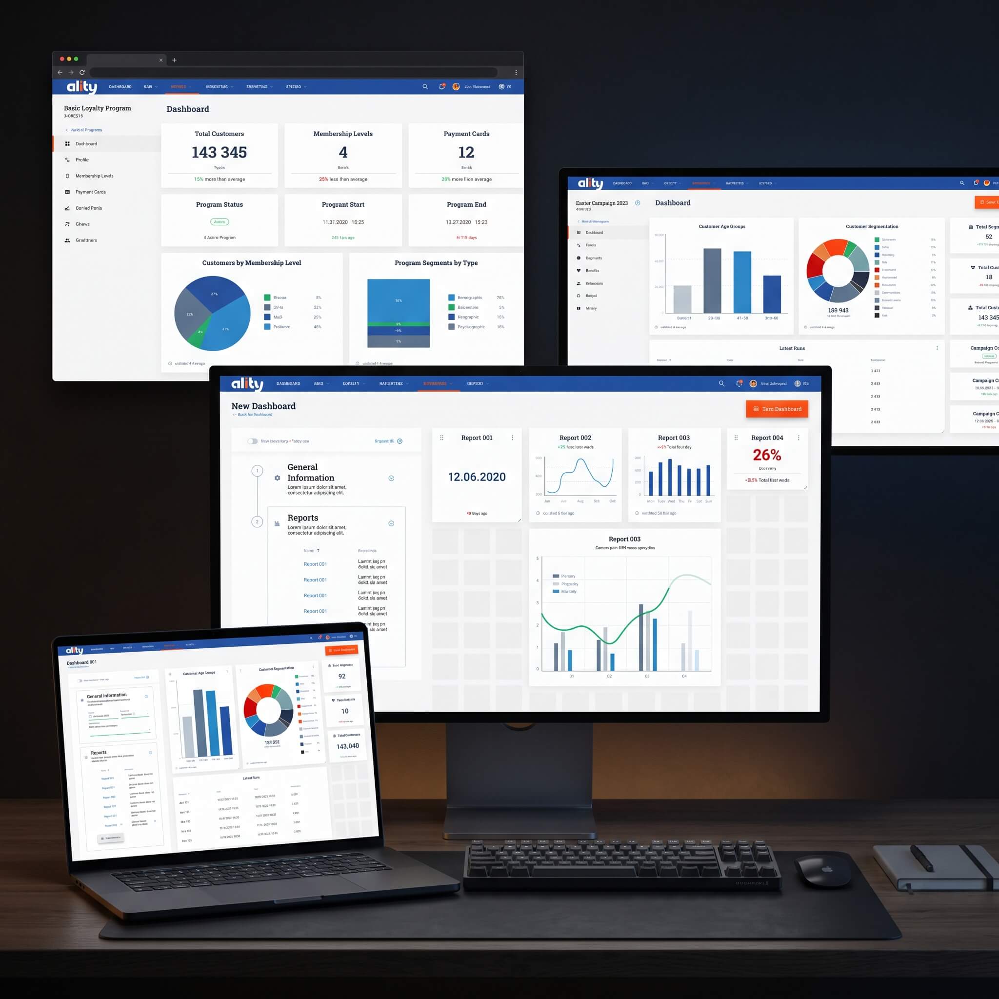
Unified navigation across five modules
My Role
I ran stakeholder interviews and task analysis across all four roles before drawing a single screen, then designed a modular architecture — CRM, Campaigns, Promotions, Reports, Configuration — where each module kept its own logic while sharing one navigation shell. The harder problem was scale: with hundreds of unique views across five modules, visual drift was inevitable without a governance layer. I built a token-based design system that became the platform's single source of truth, so any new screen inherited correct spacing, color, and component behavior by default rather than by convention.


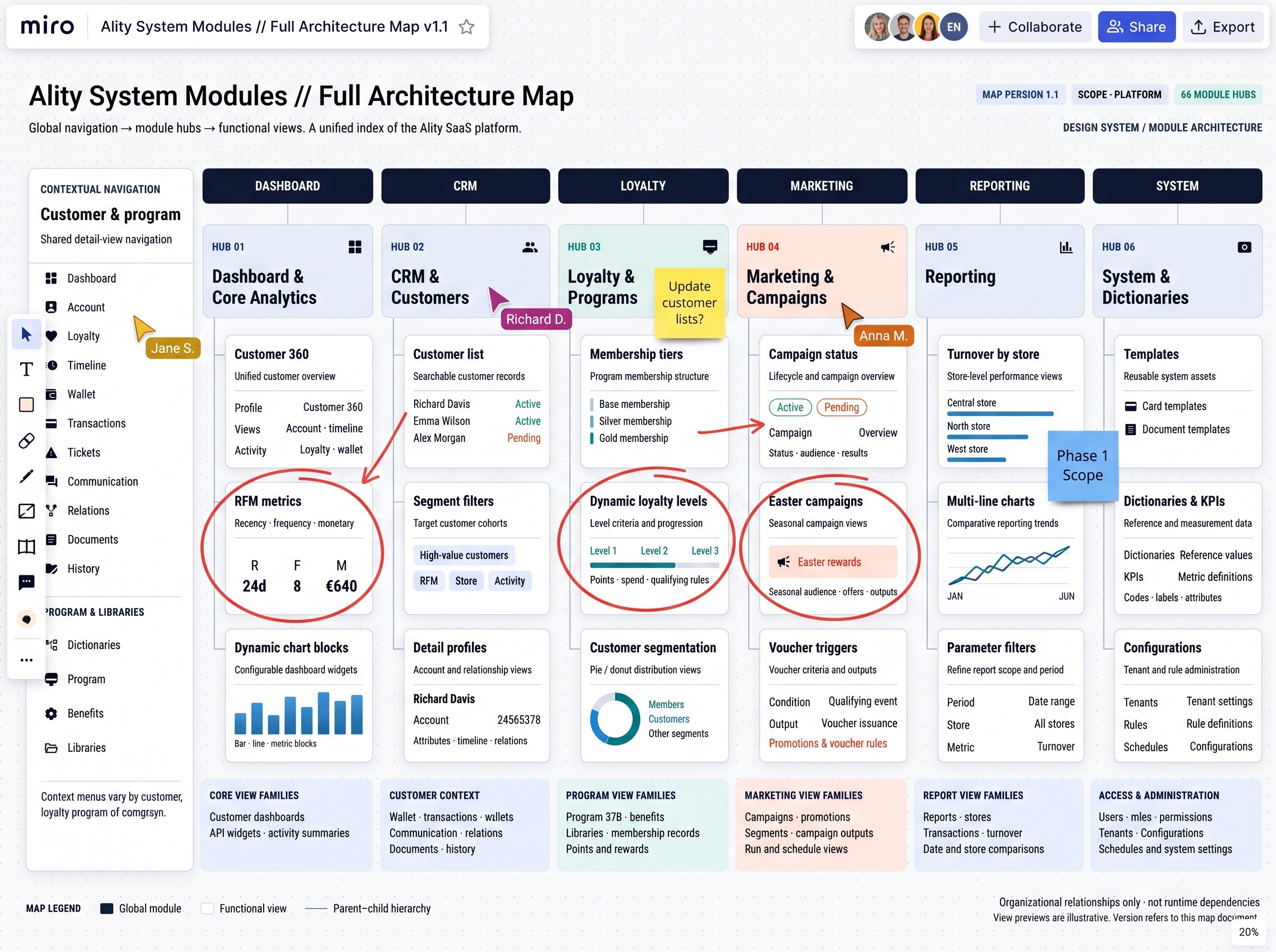
To prevent the sheer volume of features from becoming a navigation nightmare, we broke the system down into six distinct operational pillars: Dashboard, CRM, Loyalty, Marketing, Reporting, and System. This interactive workspace captured the crucial work of active team alignment, complete with sticky notes defining the "Phase 1 Scope," feature verifications, and priority highlights for elements like RFM metrics and dynamic loyalty levels. By hammering out the logic, dependencies, and scope here first, this board became our single source of truth, ensuring that the high-fidelity UI design phase remained focused purely on optimizing the user experience rather than untangling structural chaos.
The Result
The platform now runs consistent interaction patterns across every module regardless of who's using it or which team built the feature. That consistency was the actual win: engineering could ship new functionality on a three-year-old codebase without a designer re-litigating spacing or component behavior on every pull request.
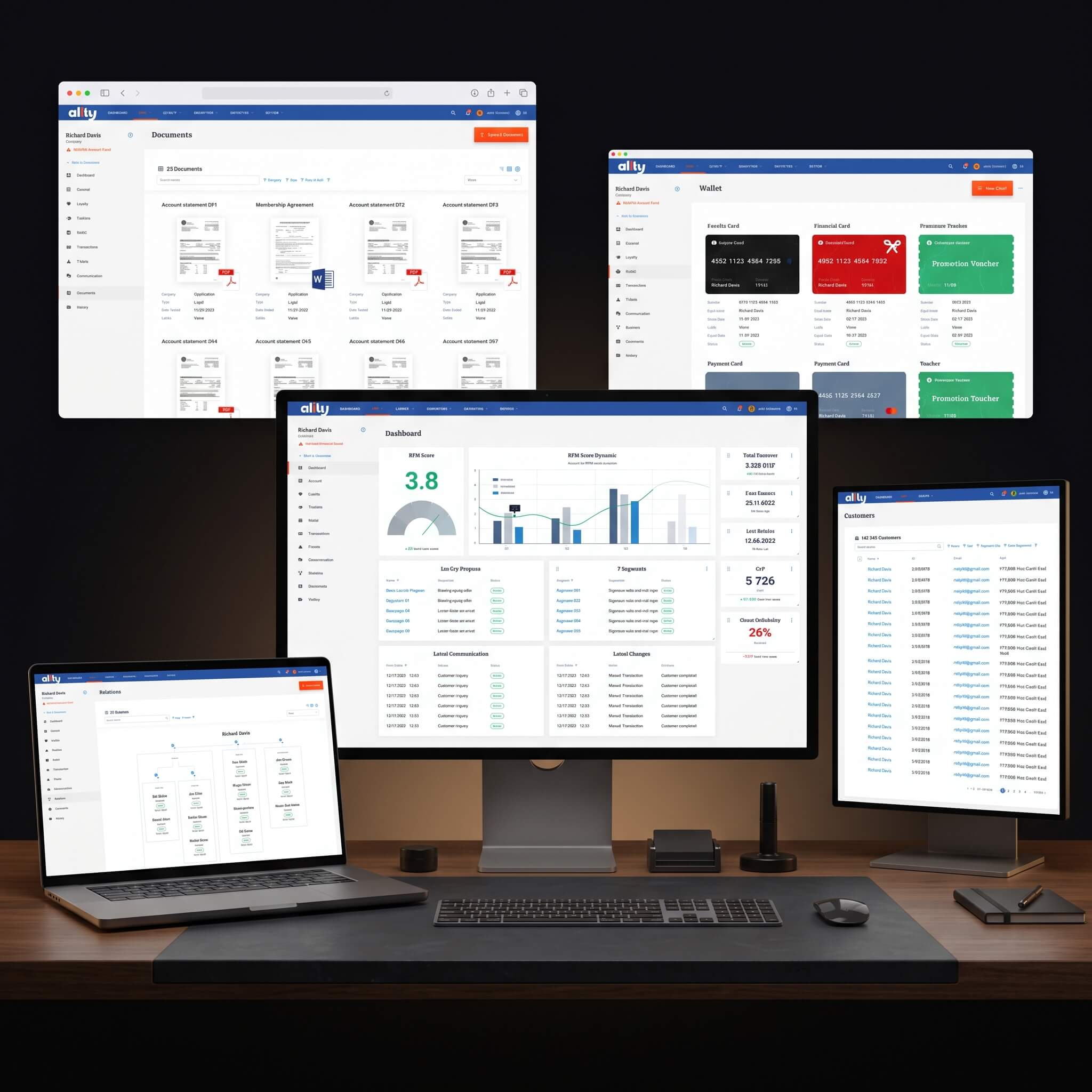
Design system token reference